Seeing is Believing
As organizations increasingly move their operations to the cloud, the sheer complexity of distributed systems has skyrocketed.
Traditional methods of monitoring and managing these environments—sifting through text-based logs or spreadsheet-style dashboards—can’t keep up with the scale or speed of modern infrastructure.
That’s why cloud visualization has emerged as a crucial solution for teams looking to gain real-time insights into their applications and services.
Below, we dive into what cloud visualization is, how it evolved, and why it’s quickly becoming an essential tool for navigating the ever-changing cloud landscape.
By the end, you’ll see how visualization can transform your approach to cloud management—from pinpointing interdependencies to driving smarter, data-informed decisions.
What Is Cloud Visualization?
Humans have always turned to visuals to make sense of complexity. Our ancestors painted on cave walls to track herds and plan hunts, and centuries later, Napoleon famously mapped battle movements from the safety of his command tent instead of riding to the top of a hill.
Fast forward to the era of AI, AR and VR—think Minority Report as an albeit dated reference—and it’s clear we’re still using visualization to grasp larger systems at a glance.
Enter cloud visualization: an innovative approach that gives you a comprehensive, bird’s-eye view of your entire cloud ecosystem. Instead of sifting through endless dashboards or text logs, you see all your cloud resources, relationships, and dependencies laid out in an interactive diagram. It’s a powerful way to cut through the noise and truly understand how complex, ever-changing infrastructure elements fit together.
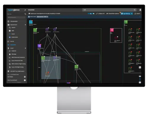
An Example Cloud Diagram in Hyperglance
Across tech today, we’re witnessing a “visualization renaissance,” spurred by the rise of Cloud Computing, Big Data, and APIs. These megatrends produce vast amounts of information—too much for anyone to digest via numbers on a screen. Companies like Netflix have openly shared their struggles with daily data overload, and visualization is one of their go-to tactics for pinpointing useful signals amid the din.
The best part? You don’t need the research budget of a tech giant or a PhD to tap into these benefits. Modern tools—like Hyperglance—are democratizing cloud visualization, making it accessible to anyone who needs to see, analyze, and optimize their cloud infrastructure. Instead of being an exclusive toolset for big-budget pioneers, visualization is now a practical, impactful strategy that any team can adopt.
6 Reasons To Use Cloud Visualization
1. Cloud Complexity Is Skyrocketing
With the widespread adoption of multi-cloud strategies, containerized applications, and microservices architectures, the complexity of cloud environments has exploded.
For many organizations, the sheer number of interconnected services and dependencies is uncharted territory.
Cloud visualization cuts through this noise by offering an intuitive map of where your resources are and how they interact, giving you an immediate handle on your architecture's sprawl.
🏷️ Looking to level up your tagging strategy? Check out our tagging best practices.
2. IT Ops Is in Demand Like Never Before
From preventing outages to optimizing costs, modern IT teams juggle more responsibilities than ever.
Rapid changes in infrastructure configurations and surging user expectations pile on the pressure.
Visualization tools allow IT Operations to detect misconfigurations faster, quickly identify resource bottlenecks, and streamline routine management tasks—all while giving executives confidence that critical systems are under control.
3. Visualization Simplifies Hidden Cloud Complexity
It’s easy to underestimate the number of moving parts in your cloud until something goes wrong.
Text-based logs or spreadsheets might surface issues, but they rarely help you see the relationships behind them.
Visualization tools, on the other hand, create interactive diagrams that reveal dependencies at a glance—ideal for troubleshooting, capacity planning, or just making sense of large-scale deployments.
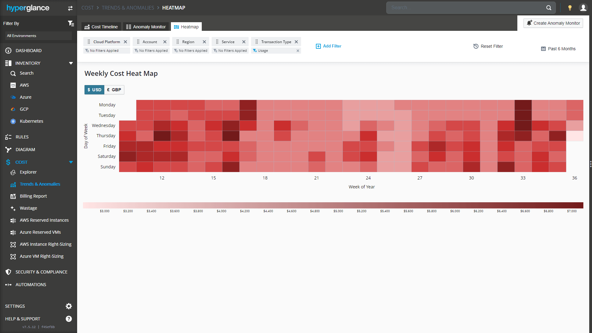
An Example Cost Heatmap Visualization in Hyperglance
4. Cloud Pioneers & High-Performing IT Organizations Embrace Visualization
Industry leaders like Netflix, Amazon, and Google have set the standard for efficient cloud operations, partly by harnessing advanced visualization strategies.
These innovators understand that visual insights enable quicker iteration, smoother rollouts, and more informed decision-making.
Follow their lead and you too can tap into the same advantage that propels high-performing IT organizations ahead of the competition.
5. Visualization Boosts Collaboration & Speeds Up Troubleshooting
One of the biggest benefits of cloud visualization is its ability to bring teams together.
Instead of relying on Slack messages or endless log data, teams can discuss issues while looking at the same dynamic diagram.
This shared view makes it easier for stakeholders—from DevOps to Security—to collaborate on fixes in real time.
The result? Dramatically faster resolution of incidents and fewer misunderstandings about the root causes of problems.
6. Visualization Will Become Increasingly Essential
As businesses continue migrating critical operations to the cloud, the amount of data to parse and systems to manage will only grow.
Visualization tools have moved from “nice-to-have” to “must-have” status for modern infrastructure management.
Ultimately, investing in cloud visualization today means positioning your organization to adapt swiftly to tomorrow’s challenges, keeping pace with evolving technologies and market demands.
What to Look For in a Cloud Visualization Tool
As cloud infrastructures become more dynamic and dispersed, your visualization tool needs to do more than just draw pretty pictures.
It should give you deep, real-time insights into how your resources connect, where costs accumulate, and how you can improve operational efficiency.
Here are the key features and capabilities to consider when choosing the right solution:
Comprehensive, Multi-Cloud Coverage: Look for a tool that natively supports AWS, Azure, and GCP—especially if you’re juggling different environments. This ensures you can see every part of your infrastructure in a single, unified interface.
Interactive & Real-Time Visuals: Static maps or outdated network diagrams won’t help you keep pace with the speed of cloud. Instead, choose a solution that continuously updates, highlighting changes as they occur. Having the ability to zoom in and out—from a high-level architectural view down to specific resource configurations—makes a dramatic difference when troubleshooting or planning.
Insightful Cost Optimization Features: Simply seeing your infrastructure is valuable, but tying it to cost data is even more powerful. Whether it’s a cost explorer Sankey diagram or a billing heatmap, these visualizations help you identify where resources might be underutilized or accruing unexpected charges. Tools like Hyperglance provide intuitive ways to map spending onto your environment, so you can spot—and act on—cost-inefficient areas.
Customizable Diagrams & Automated Resource Discovery: Good visualization isn’t one-size-fits-all. Make sure your tool can automatically discover your cloud resources, then let you tailor how they’re displayed. Being able to group elements by tag/project, highlight specific dependencies, or overlay data such as CPU utilization or security settings helps you focus on what matters most to your team.
Scalability & Performance: As your infrastructure grows, you don’t want your visualization tool to become a bottleneck. Check whether the tool can handle large, complex deployments without slowing down. A laggy interface won’t be helpful when you’re trying to quickly diagnose an issue in a sprawling multi-cloud architecture.
Security & Compliance Overlays: Beyond cost and performance, security posture is critical in any cloud environment. Some visualization platforms allow you to overlay security policies, firewall rules, or compliance checks directly on top of your diagrams. This helps you instantly see where vulnerabilities might exist and where further hardening is needed.
Easy Collaboration & Sharing: Visualization is most valuable when everyone—DevOps, FinOps, leadership, and beyond—can see and discuss the same picture. The ability to export dashboards & diagrams, and share links or snapshots with stakeholders can drastically speed up incident resolution and cross-team communication.
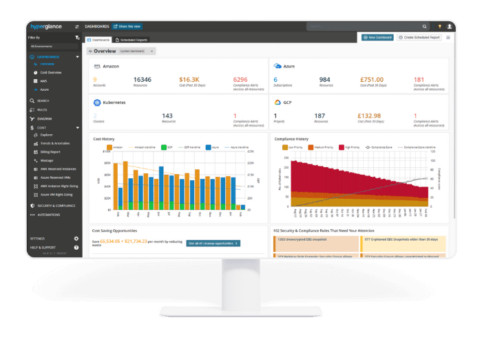
An Example Cloud Dashboard Including Various Visualizations
To Summarize
Cloud visualization is way beyond a trend—it’s a pivotal strategy for organizations grappling with the growing demands of modern IT.
From taming the spiraling complexity of multi-cloud environments to boosting collaboration and maintaining operational excellence, visualization transforms raw data into actionable insights.
Visualization empowers teams to pinpoint hidden inefficiencies, simplify troubleshooting, and optimize costs, all while keeping the bigger picture in focus.
However, not all visualization tools are created equal. When choosing a solution, look for features that provide comprehensive coverage, real-time updates, and granular cost-optimization capabilities. Security overlays, scalability, and ease of collaboration can further elevate the impact of your visualization strategy.
Ultimately, adopting a robust, feature-rich platform—such as one offering interactive diagrams, cost explorer Sankey, or cost heatmap—helps you stay a step ahead in an ever-evolving, cloud-first world.
By prioritizing the right combination of capabilities and aligning them with your team’s specific needs, you’ll unlock greater efficiency and set your organization up for long-term cloud success.
Best-in-Class Tools for FinOps, Architects & Engineers
Hyperglance is rapidly becoming the preferred cost optimization tool of FinOps, GreenOps and Cloud professionals worldwide.
Open your eyes to a world of detailed analytics, actionable insights, codeless automation, billing reports, trend analysis, and anomaly detection.
The only thing dropping as fast as your cloud costs will be your stress level.
Why Choose Hyperglance?
- From RI recommendations to right-sizing and orphaned resources, Hyperglance ships with a best-in-class cost-optimization rules engine and billing reports.
- Layer your AWS, Azure & GCP costs over intuitive, interactive exportable diagrams and customizable dashboards. Find problem resources using powerful filtering and grouping.
- Access deep analytical views of cloud usage, enabling rapid resource optimization, anomaly detection & alerting, proactive cost management, and laser-accurate forecasting.
- Cost optimization is just the start. Use Hyperglance to explore enlightening real-time inventory diagrams, identify and fix security issues, and automate jobs.

About The Author: David Gill
As Hyperglance's Chief Technology Officer, David looks after product development & maintenance, providing strategic direction for all things tech. Having been at the core of the Hyperglance team for over 10 years, cloud optimization is at the heart of everything David does.
