What is Cloud Visualization?
Visualization is a human trait; it's been part of us since our ancestors painted on cave walls to map animal types, movement and the hunt.
Visualization is the representation of an object, situation, or set of information as a chart or other image
A more recent example of visualization as innovation was when Napoleon used the technique in the early 19th century wars. He worked out that he didn't need to put himself in danger to see everything at the top of a hill when he could visualize the battle from his tented HQ.
Fast forward into our future and we are getting close to Minority Report-style interfaces through the use of augmented and virtual reality.
How about cloud visualization, I hear you ask?
Cloud visualization is a cutting-edge technology that provides a comprehensive, bird's-eye view of an organization's entire cloud ecosystem. This intuitive form of visualization presents users with interactive diagrams of their cloud infrastructure, including all interconnections and dependencies.
Across the technology industry today we are witnessing a visualization renaissance amongst the megatrends of Cloud Computing, Big Data and APIs. The technologies behind these systems are big, complex and constantly changing - they cannot be managed by people staring at screens full of numbers.
Cloud pioneers such as Netflix openly talk about their struggles with daily work to separate signal from noise in their complex, changing systems. One of the key solutions to this is using visualization in your cloud operations.
Thanks to a new crop of visualization technologies and companies, the good news is you don’t need a PhD or have the resources of Google to enjoy these benefits, you don’t need to be a specialist in visualization, and you can start today. Tools like Hyperglance are democratizing visualization for everyone else.
5 Reasons Why You Should Be Using a Cloud Visualization Tool
1. IT Ops is in Demand Like Never Before
I remember when Operation teams were contained in the cellars, without even a slither of daylight.
Today we can proudly attend vast conferences like AWS re:Invent, almost solely dedicated to Operations and its practitioners (by the way, check out our top tips for attending re:Invent).
These events are held in glamorous venues in cities like Vegas, Berlin, London and New York with keynotes from seriously talented and, dare we say, cool speakers.
Attendees talk freely about using big data, visualization and empathy. Why? I see the evidence being an emerging culture, based on detailed research, to move towards the goal of becoming a high performing IT organization, as described in previous 'State of DevOps' reports.
Much is said of the sharing economy, but you can see free knowledge sharing in action at these events and online through blogs and social media.
Operations thinkers and speakers are respected and listened to.
One aspect of operations I’m particularly interested in, as it’s my sphere of expertise, is visualization in modern operations.
2. Cloud Pioneers Use Visualization
Visualization is literally everywhere in the technology industry.
We are surrounded by infographics, big data charts, and data-rich interactive maps.
That's largely thanks to humans preferring pictures and stories over impenetrable walls of text data.
Thought-leading software companies such as Netflix talk about operations a lot. They share their insights not just because they want to look clever or increase movie downloads.
In fact, one key reason that Netflix publicly reveals insights into their operations is that it attracts engineering and operations talent.
Cloud pioneers like Netflix prefer to show rather than tell, so they show the pictures they look at every day and the interfaces from their daily work.
Here’s an example of a top-level visualization at Netflix:
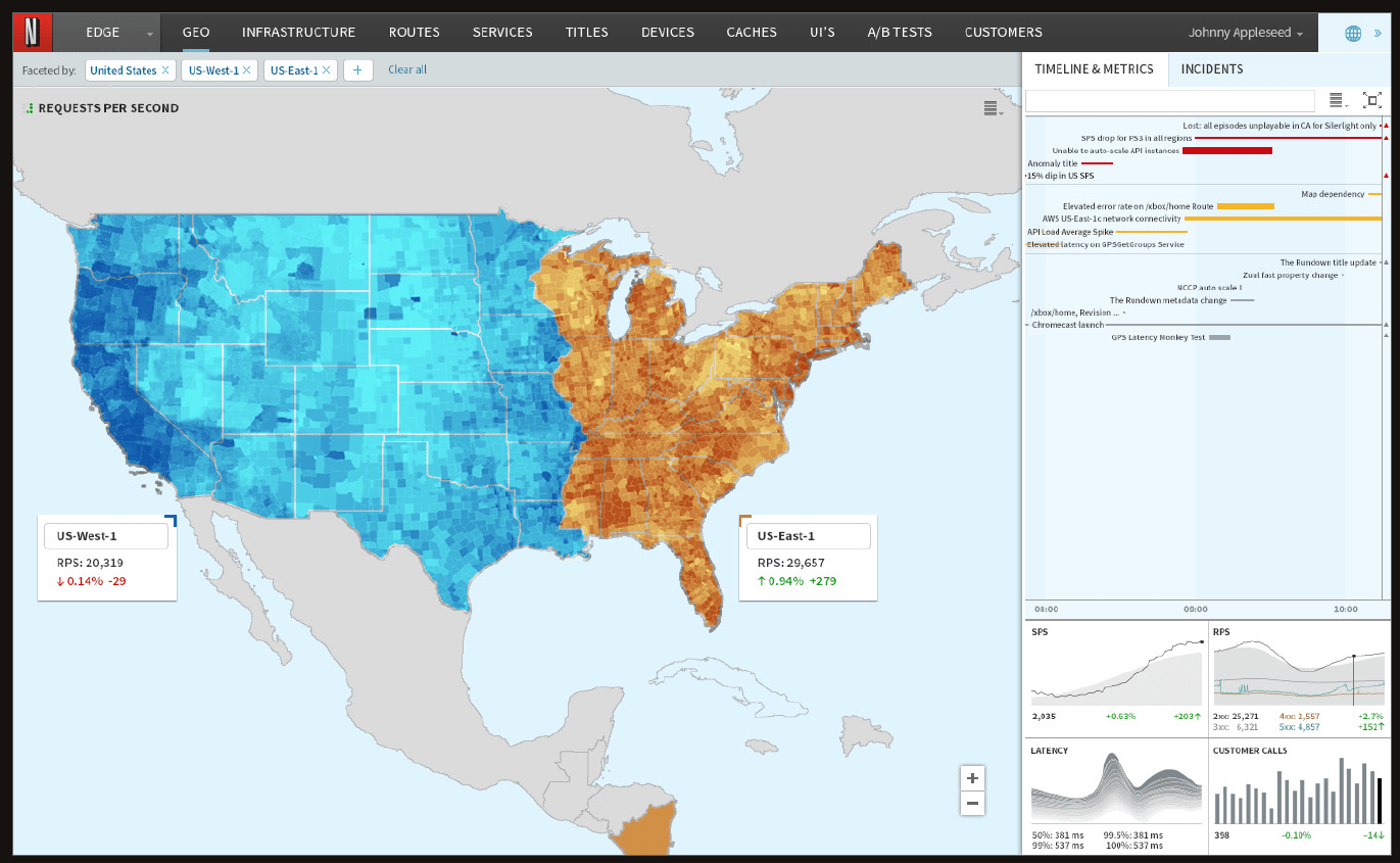
Source: Netflix Tech Blog, Improving Netflix’s Operational Visibility with Real-Time Insight Tools
Why does Netflix use visualization, you ask?
In the words of Ranjit Mavinkurve, Justin Becker and Ben Christensen...
"Operational visibility with real-time insight enables us to deeply understand our operational systems, make product and service improvements, and find and fix problems quickly so that we can continue to innovate rapidly and delight our customers at every interaction."
3. High Performing IT Organizations Use Visualization
Puppetlabs' State of DevOps Reports remain a must-read for everyone in the IT business, from Operations staff up to the board. The authors are impeachable, the report methodology is solid, and the insights are unique and of higher quality than your usual industry surveys.
The 2015 iteration was the first time a report uncovered the metrics and practices that differentiate a high performing organization from the rest. One headline example from the report, and which company wouldn’t want this kind of performance?
"High-performing IT organizations experience 60x fewer failures and recover from failure 168x faster than their lower-performing peers. They also deploy 30x more frequently with 200x shorter lead times."
In the same 2015 report, the authors identify visualization as an effective way to build quality into the system:
"The more you build quality into the system — through automation, reducing batch sizes and shortening cycle times — and the more effectively you manage your team’s workload and visualize work queues, defects and bottlenecks, the more you increase throughput and stability."
The visualization aspect of DevOps is also crucial to what renowned author, Gene Kim, describes as The Second Way: Amplifying Feedback.
The Second Way is a simple but powerful method of feeding back the system reality (in operations) back to the system creators (in development).
With visualization systems in place, everyone can access a model of what’s happening in real-time with data-rich interactive maps and diagrams.
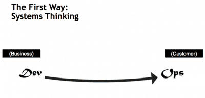
Source: Gene Kim, IT Revolution, The Three Ways: The Principles Underpinning DevOps
4. Cloud Visualization Simplifies Hidden Cloud Complexity
Despite some stiff competition, Amazon Web Services (AWS) is the dominant cloud provider. At last count, AWS had 32% market share, nearly twice that of its nearest competitor (Azure).
It’s not just their size, too. The list of services that AWS offers is still what sets them apart from all other cloud providers.
What this means is that everyone using the AWS cloud has to use the AWS console; they are faced with a mountain of powerful features that look like this:
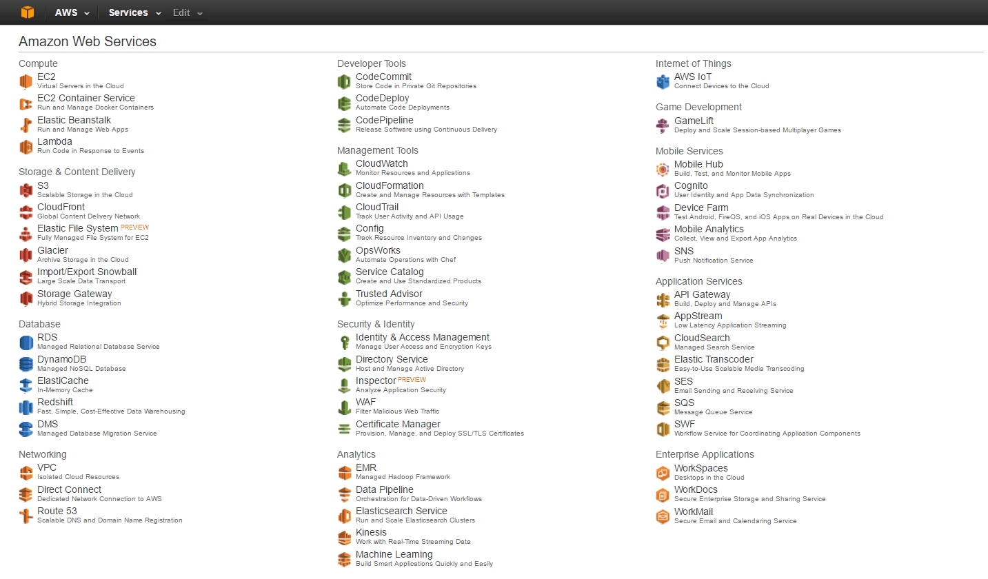
Source: AWS Management Console
Now imagine lifting the lid of this console to expose all the configured, running systems underneath: the EC2 virtual machines connected to security groups and route tables and back to an on-premises datacenter via VPC and VPN. And that’s just EC2, one small part of AWS cloud infrastructure.
Trying to understand what is important from this noisy view is very difficult for new and experienced users alike.
Pages of text look like noise to our brains. Humans need pictures, they need visualizations, especially if they need to be on the same page like an operations team.
Forcing a team of people to find the same conclusions as to what’s operationally happening just from the AWS console is time-consuming and error-prone.
People have different abilities in using the AWS console; they probably have different roles and therefore visibility into the console.
Instead of looking at the same picture, teams are left each bringing their little piece of the jigsaw. All they wanted to a single version of the truth, often across a multi-cloud setup, maybe factoring in Kubernetes. The best visualization tools can do this. The AWS console most definitely cannot.
5. Visualization Will Become Increasingly Essential
Using public cloud services means inevitable change for every IT organization.
Mark Holt, CTO of The Trainline, has completed a full migration to AWS Cloud from their on-premises Oracle Exadata.
His experience shows that many things change, not just the technology, and the key to this is the whole team’s understanding of the system using data and visualization.
It's clear now that life in the cloud is here to stay. Perhaps even clearer is the fact that cloud management is only going to become more complicated. The foundations of early cloud infrastructure are under growing scrutiny as more companies expand into larger and/or multi-cloud setups.
If you've never visualized your cloud, there's no time like the present.
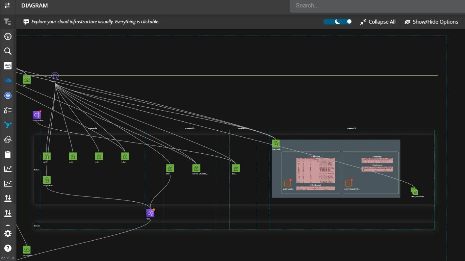
What Tools Are Used For Cloud Visualization?
Not so many years ago, tools like Microsoft Visio and Lucidchart were the go-to tools for cloud diagrams. Although relatively cheap, diagrams would almost always need to be created manually. They were not only time-consuming but incredibly error-prone.
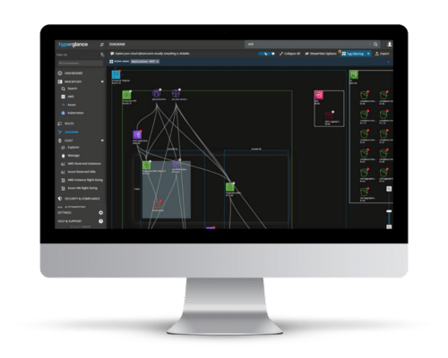
Move forward a few years, and cutting-edge tools like Hyperglance have automated diagram creation and exploration. Not only are the diagrams interactive, but they are faster to create and update, and don't miss a beat in terms of your resources. The deep search capability, coupled with built-in monitoring and automation.
Need a Cloud Architecture Visualization Tool?
Trying to understand how your cloud is configured, let alone related, is becoming increasingly difficult.
Within minutes, Hyperglance can show you your aggregated cloud inventory in an intuitive, interactive diagram:
- See all your AWS, Azure, & Kubernetes cloud architecture in one scalable view that updates continuously
- Overlay metadata onto your cloud diagram, including cost, to add important context
- Explore resource dependencies and links, and view/search detailed metadata
- Switch to see your cloud inventory & search results with one-click
- Export your diagrams, as often as you like, to VSDX (Visio), PNG, or CSV; automate exports using our RESTful API
- Hyperglance is self-hosted, deployed through the AWS & Azure Marketplaces, in Kubernetes, or installed on your own instance/VM
Hyperglance - Cloud Management You Control
Hyperglance gives you complete cloud management enabling you to have confidence in your security posture and cost management whilst providing you with enlightening, real-time architecture diagrams.
Monitor security & compliance, manage costs & reduce your bill, interactive diagrams & inventory, built-in automation. Save time & money and get complete peace of mind.
Book a 30-minute demo today, or experience it all, for free, with a 14-day trial.

About The Author: David Gill
As Hyperglance's Chief Technology Officer, David looks after product development & maintenance, providing strategic direction for all things tech. Having been at the core of the Hyperglance team for over 10 years, cloud optimization is at the heart of everything David does.

