New in Hyperglance v7.5
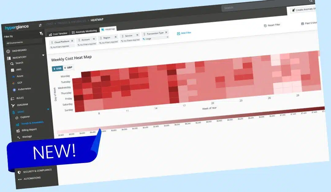
Introducing our latest feature: a cloud cost heatmap that visualizes your costs by the day of the week for up to 12 months.
By using varying intensities of color, this heatmap provides a clear view of your spending patterns, with darker shades indicating higher costs and lighter shades showing lower ones.
Heatmaps are another great way to identify trends and optimize your cloud resource management, helping you make smarter decisions based on when your costs are highest or lowest.
Feature Spotlight
You can access your customizable cloud cost heatmap via Cost > Trends & Anomalies > Heatmap

- Support for AWS, Azure and GCP
- Change the timescale from days to up to 1 year
- Hover over days to see more details
- Click on days and view a breakdown of the data in a timeline or in Hyperglance's built-in cost explorer
- Filter the visualization by cloud platform, account, region and service, and currency
Why Use Heatmaps To Visualize Cloud Costs?
1. Quick Identification of Patterns and Trends
Visual Clarity: Heatmaps use color intensity to represent data values, making it easy to spot patterns, trends, or anomalies at a glance. This means you can quickly identify which days have higher or lower spending.
Highlighting Peaks and Valleys: The varying shades help in quickly pinpointing days with significantly higher or lower costs, allowing users to understand cost distribution over time.
2. Intuitive and Easy to Understand
User-Friendly: Heatmaps are simple and don't require advanced technical knowledge to interpret. The concept of darker colors representing higher values and lighter colors representing lower values is easy to grasp, making the data accessible to a wider audience.
Immediate Insight: Unlike complex charts or tables, heatmaps provide an immediate visual cue that helps users quickly understand the data without needing to read detailed labels or legends.
3. Efficient Resource Management
Cost Optimisation: By visualizing cloud costs by the day of the week, users can easily identify patterns of high and low usage. This helps in understanding when cloud resources are most and least used, enabling more strategic decision-making to optimise costs, such as scaling resources during off-peak days.
Targeted Analysis: Users can focus on specific days or time frames where cost-saving measures can be applied, such as shutting down non-essential services during weekends or evenings.
4. Enhanced Decision-Making
Strategic Planning: Heatmaps can assist in forecasting and planning by highlighting when peak cloud usage occurs. This allows businesses to better prepare for high-cost periods and manage budgets accordingly.
Identifying Inefficiencies: Consistent patterns of high costs on specific days may indicate inefficiencies or opportunities for improvement, such as unutilized or underutilized resources.
5. Data-Driven Insights
Detailed Analysis: Heatmaps provide a detailed view of data without overwhelming the user with numbers. This is particularly useful when analysing large datasets, such as daily cloud costs over a month or a year.
Correlating Data: By combining heatmaps with other data visualisations (like line charts or bar graphs), users can correlate cloud costs with other factors such as user activity, application performance, or seasonal trends.
6. Improved Communication and Reporting
Clear Communication: Heatmaps make it easier to communicate complex data insights to stakeholders who may not be familiar with technical details, ensuring everyone understands the key takeaways.
Effective Reporting: Including heatmaps in reports provides a visually engaging way to present data, making reports more impactful and easier to digest.
Example Use Cases
Our new heatmap feature is perfect for highlighting cyclic cost patterns that intensify on certain days, like weekends or midweek, and for visualizing cloud costs in the context of the business week, making it easier to spot opportunities for optimization.
Batch Job Cost Management: Imagine you have a batch job that runs every Wednesday and incurs unexpectedly high costs. Overall, your application might stay within budget, so this cost spike goes unnoticed. However, with the heatmap, it becomes immediately clear that the batch job is a significant cost driver. This visibility allows you to identify the issue and optimize the job to reduce costs.
Tracking Application Usage Patterns: Consider a web application that experiences varying levels of usage throughout the week, with costs tied directly to user activity. You might notice that your application incurs higher costs on Mondays and Tuesdays when users are most active, and lower costs over the weekend. A heatmap can quickly reveal these usage patterns, making it easier to adjust resources or plan for expected spikes in activity.
Aligning Costs with Business Operations: A heatmap can also show correlations between your costs and daily business operations. For example, if you notice a 'hot' week that started on a Monday, it might align with your QA team beginning a new sprint to test a new feature. The weekly view allows you to see how costs fluctuate in relation to your team's activities, providing actionable insights.
Unlike standard line or bar graphs, which might offer only a high-level view or too much granular data, heatmaps present an intuitive way to identify patterns and relationships in your cloud costs, making it easier to understand and act on them.
Release Details
When are Cloud Cost Heatmaps Released?
Heatmaps are available now.
If you have automatic updates configured already, the new release is available immediately. It will be downloaded and updated automatically - it's that simple!
If your environment is not configured for automatic updates, then you can take advantage of the new release by following the simple instructions in this knowledge base article.
Regardless of whether your updates are automated or manual, all existing settings and configurations remain intact after the upgrade. The only changes you will see are the new navigation UI and additional features.
Who can access Cloud Cost Heatmaps?
All Hyperglance customers with up-to-date installs will get access to the new features. There's no extra cost either - heatmaps are included in your standard Hyperglance package.
How can I provide feedback?
Please log a support ticket, or email Stephen Lucas, Chief Product Officer (slucas@hyperglance.com).
Why Teams Choose Hyperglance in 2026
Hyperglance is a strong fit when cost data alone doesn’t give your team enough context.
That often happens when teams are asking questions like:
- What is running across our cloud estate?
- Who owns this resource?
- Why did this cost change?
- What else depends on it?
- Is this safe to clean up?
- Which policy, security, or compliance issue needs attention?
- Can we route this to the right owner or trigger an approved action?
We help teams connect cloud cost to infrastructure context across AWS, Azure, Google Cloud, and Kubernetes. That means FinOps, CloudOps, platform, security, and leadership teams can work from the same view.
Hyperglance is especially useful for mid-market, enterprise, MSP, public sector, and regulated teams where ownership, governance, automation, and data control matter.

What You Can Do With Hyperglance
- See cost, resources, relationships, and ownership in one place
- Visualize cloud architecture with interactive diagrams
- Find waste, policy issues, and cost anomalies faster
- Route findings to the right team through existing workflows
- Use no-code automation for approved fixes
- Run Hyperglance in your own environment when data control matters
Want to see where Hyperglance fits in your FinOps stack?
Explore the product, start a free trial, or book a demo with the team.

About The Author: Stephen Lucas
As Hyperglance's Chief Product Officer (CPO), Stephen is responsible for the Hyperglance product roadmap. Stephen has over 20 years of experience in product management, project management, and cloud strategy across various industries.
